Color in Design
One of the most important elements in creating a specific ambiance is how we use color. Whether in the home, for a party, a conference, or in advertising, selection of the right colors is key in creating the right emotion.
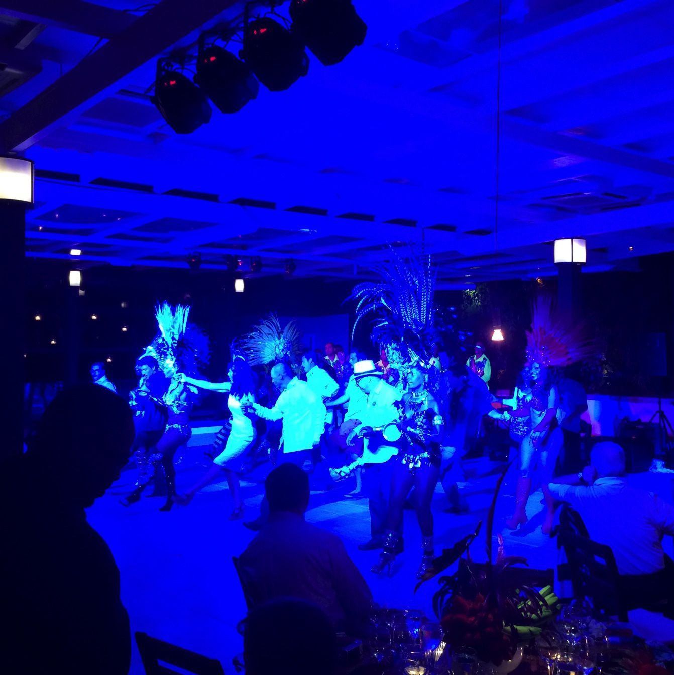
Color activates the emotions To most of us, specific colors evoke certain feelings, even if we don’t realize this on a conscious level. Take the color red. Red can be understood as sexy, passionate, warm, inviting, positive, sophisticated, and sometimes dangerous. We often associate green with tranquility, warmth, and renewal, as well as with money and thus prosperity. Black is dramatic when placed in the right context, and white always depicts purity, cleanliness, and clarity.
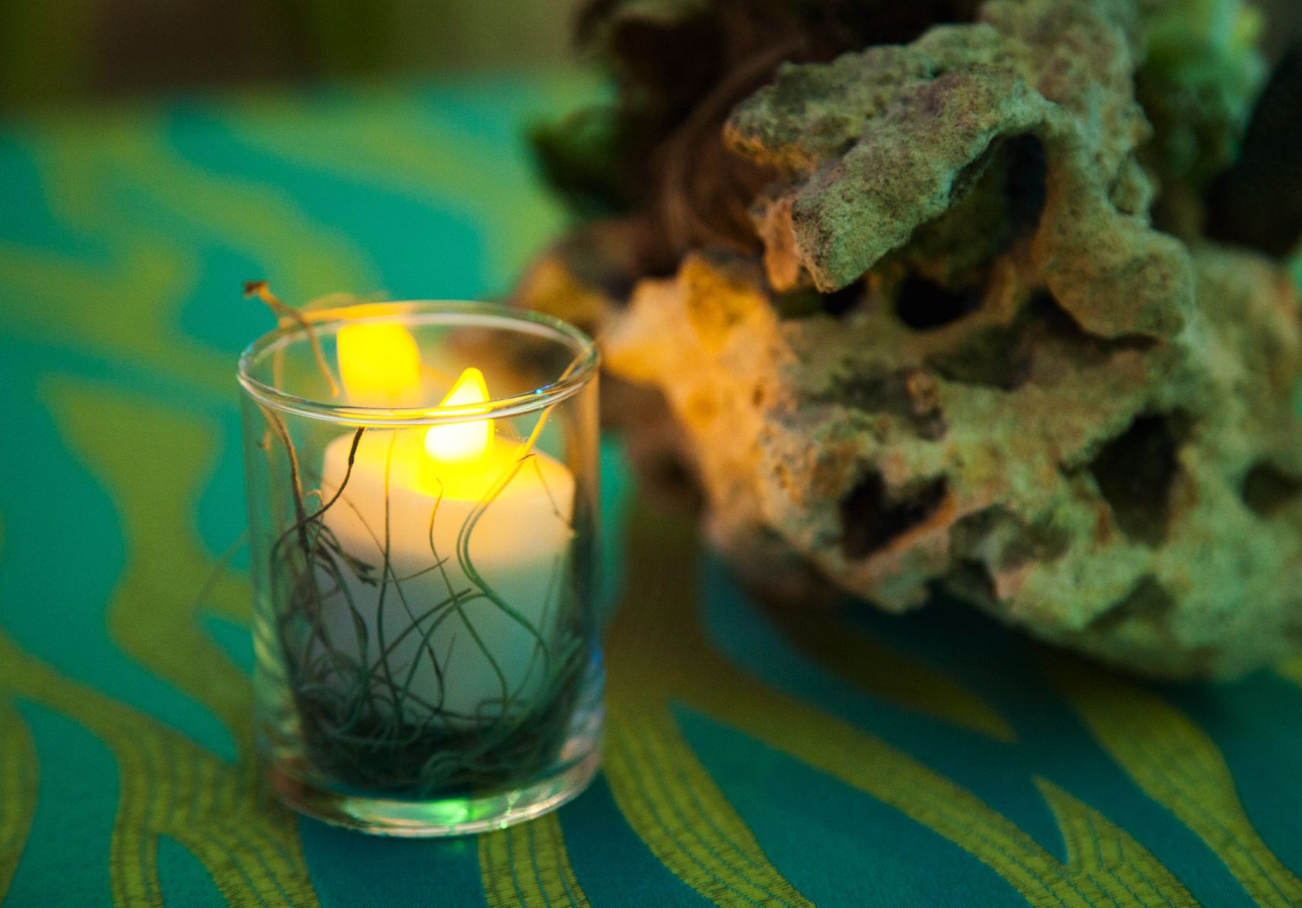
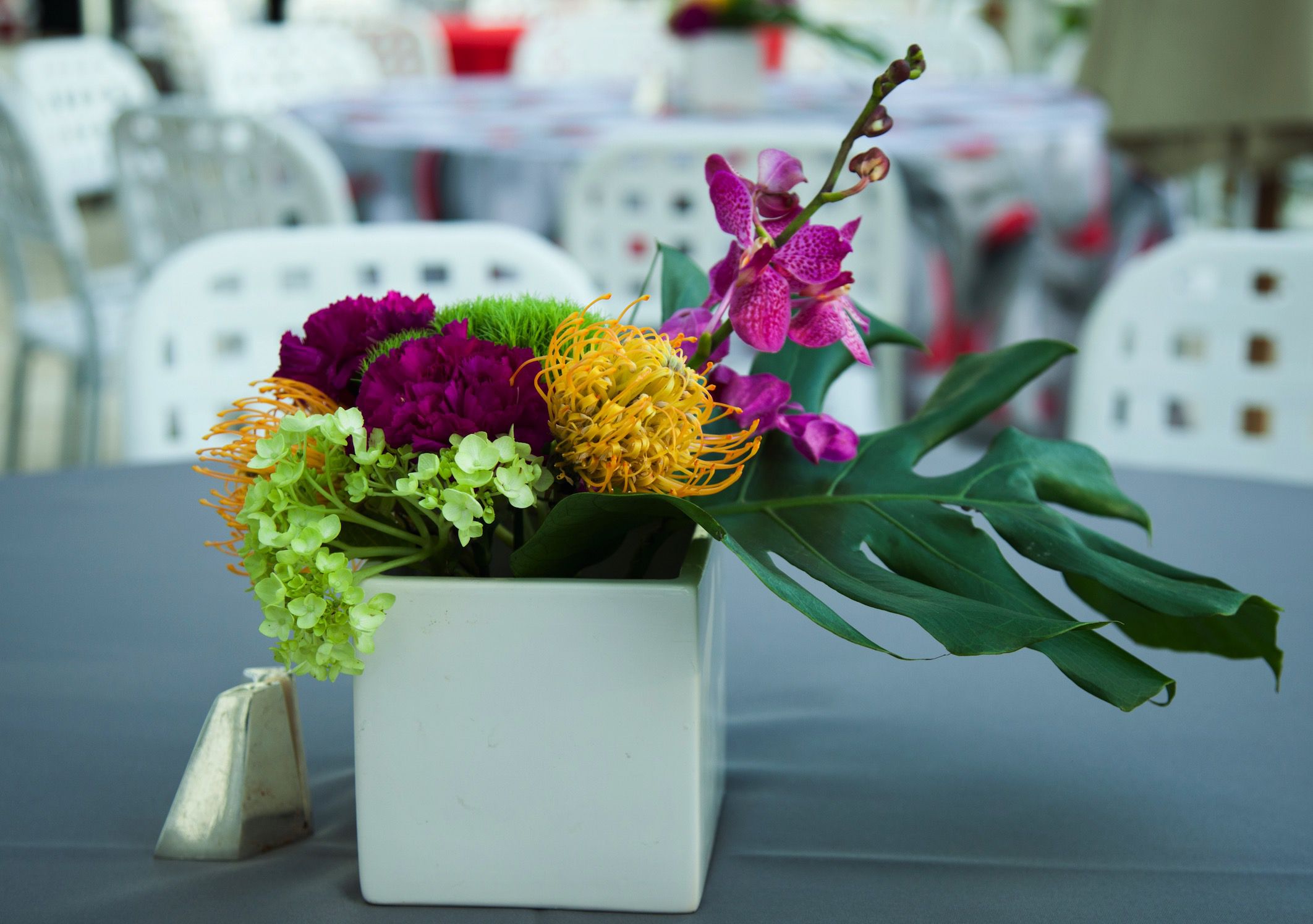
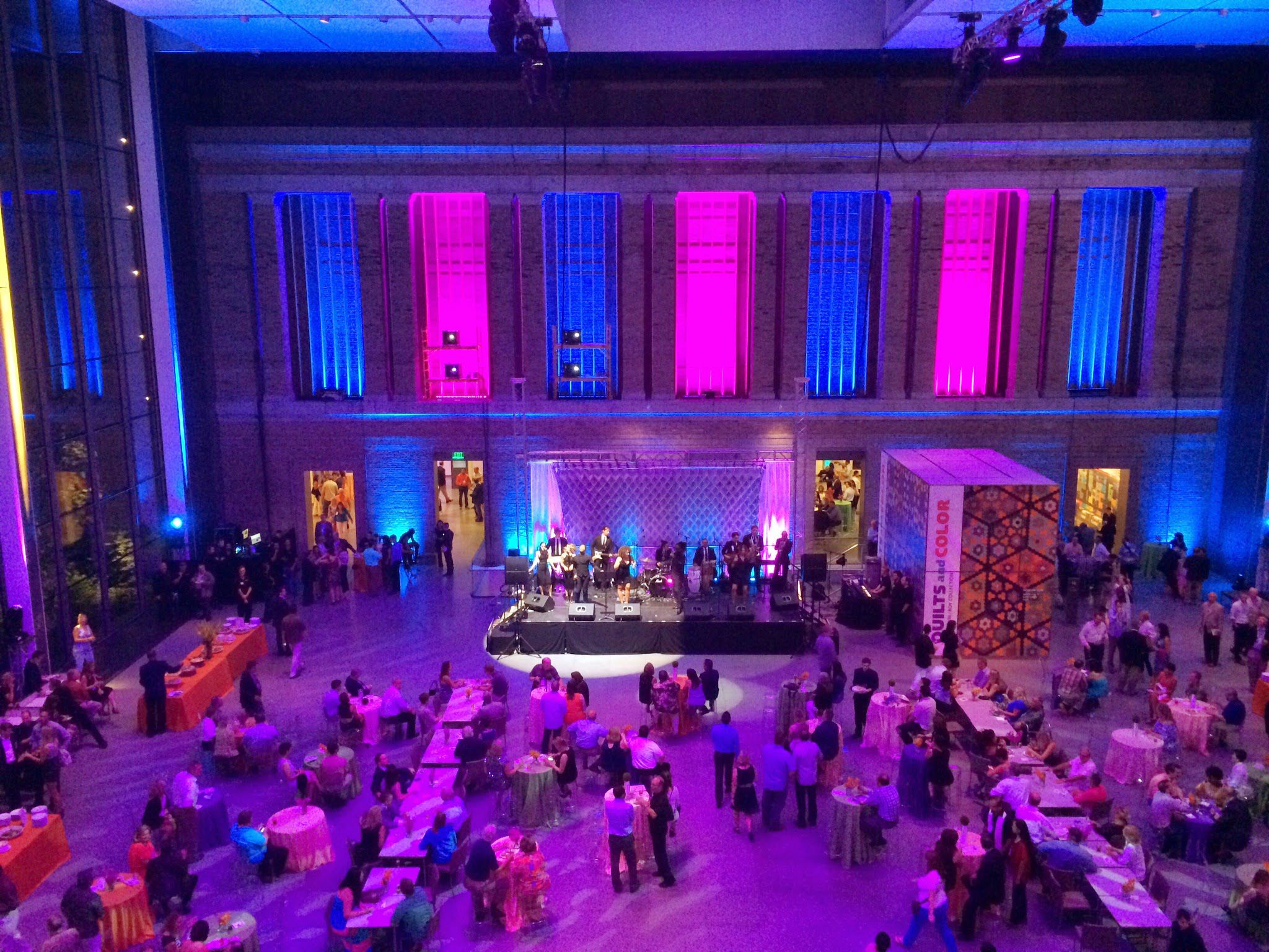
At TOCA Events, we are acutely aware of how important color combinations are for creating the right tone for a specific event. For us, understanding the type of impact our clients wish to create, as well as the results they hope to achieve, is the basic key to creating an environment that works. In this regard, choosing the right colors is the absolute foundation for transmitting the feeling that clients wish to evoke for their attendees.
There is a very specific vocabulary of color, which starts with the color wheel. Thanks to the work of Sir Isaac Newton, who discovered that colors formed a spectrum after bending light through a prism, we have the circular color wheel that starts with red and goes to orange, yellow, green, blue, purple, and then back to red. The wheel consists of primary, secondary, and tertiary colors, where primary colors can be mixed together to create secondary colors, which in turn can be mixed together to create tertiary colors. The wide variety of color schemes makes for a wonderful opportunity to find just the right hues for every emotion, which is something any artist will tell you.
Along with color combining, there is color saturation, which is the purity or brightness of a color. When it is clear and bright, it is considered highly saturated. When there is a more muted tone, it is considered to be less saturated. We also can talk about tone, which is when colors are modified by the addition of white or black. Here light tones or tints are created by mixing a given color with white, while dark shades are made with gray or black.
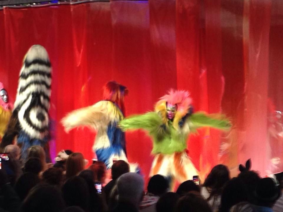
Combining colors and paying attention to saturation and tone is what creates optimum impact when creating an event. Our job at TOCA Events is to identify the mood and then follow suit with colors that work well for the message. Through good planning, the right colors will impact ideas, messages, interest, and emotion, which all come together to make a statement that works with subtle strength.
A TOCA we are intrigued by both the science and art of using color. We are fascinated by the way colors are made, as well as what color symbolizes, and recognize what a powerful tool color is in changing the way we think, act, and react.
Playing a vital role in our world, color has the power to soothe or irritate, calm our appetite or raise our blood pressure, change the look of an ordinary space, and define who you are or what you represent. Through the right use of color, we can create an instant change in perception. At TOCA, we believe that finding the right colors to express the personality and intention of the moment is an art form, which adds another dimension to the pleasure we get in working with our clients to create an environment that is consistent with the unspoken message within their event.
Sorry, the comment form is closed at this time.